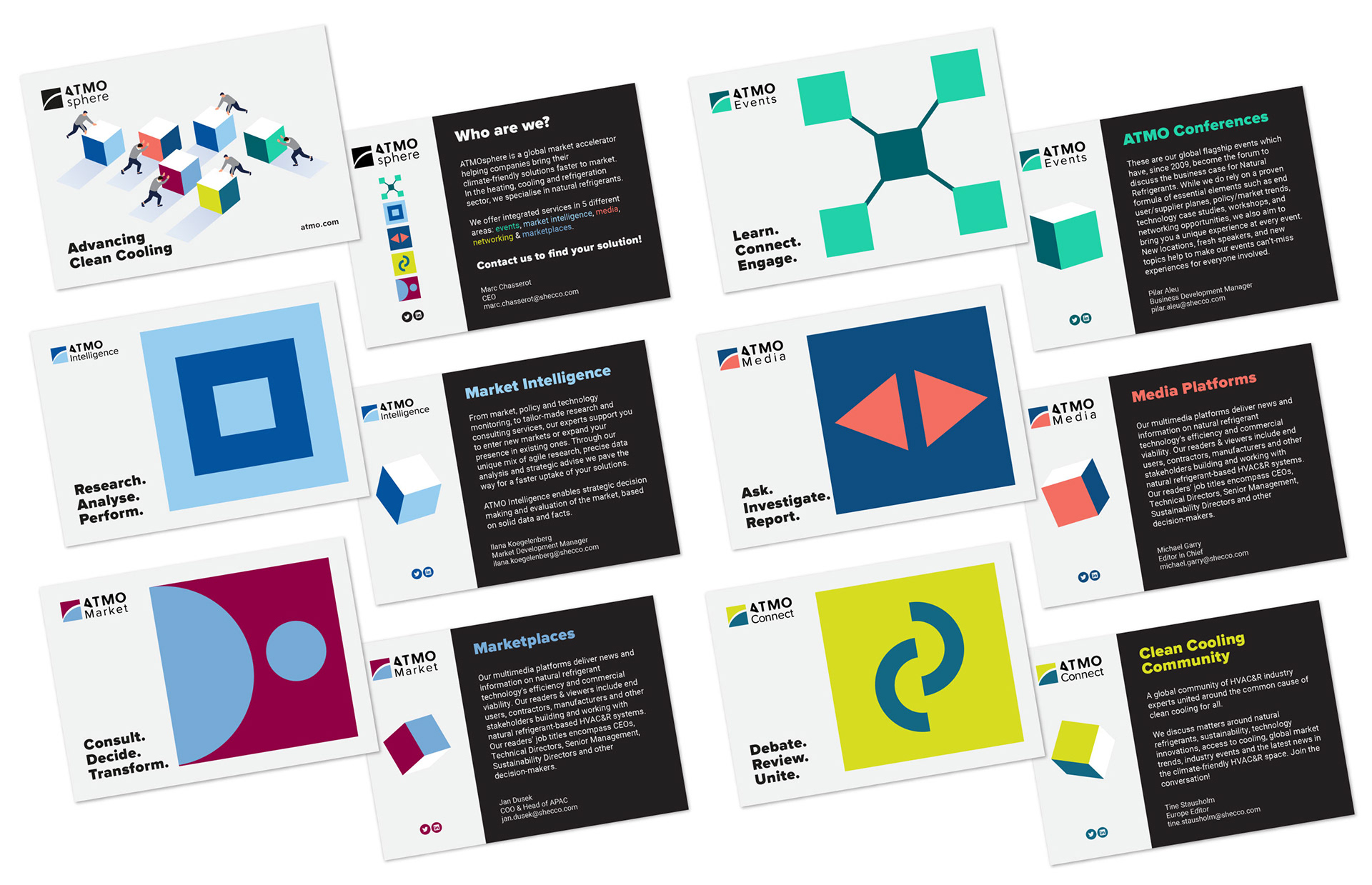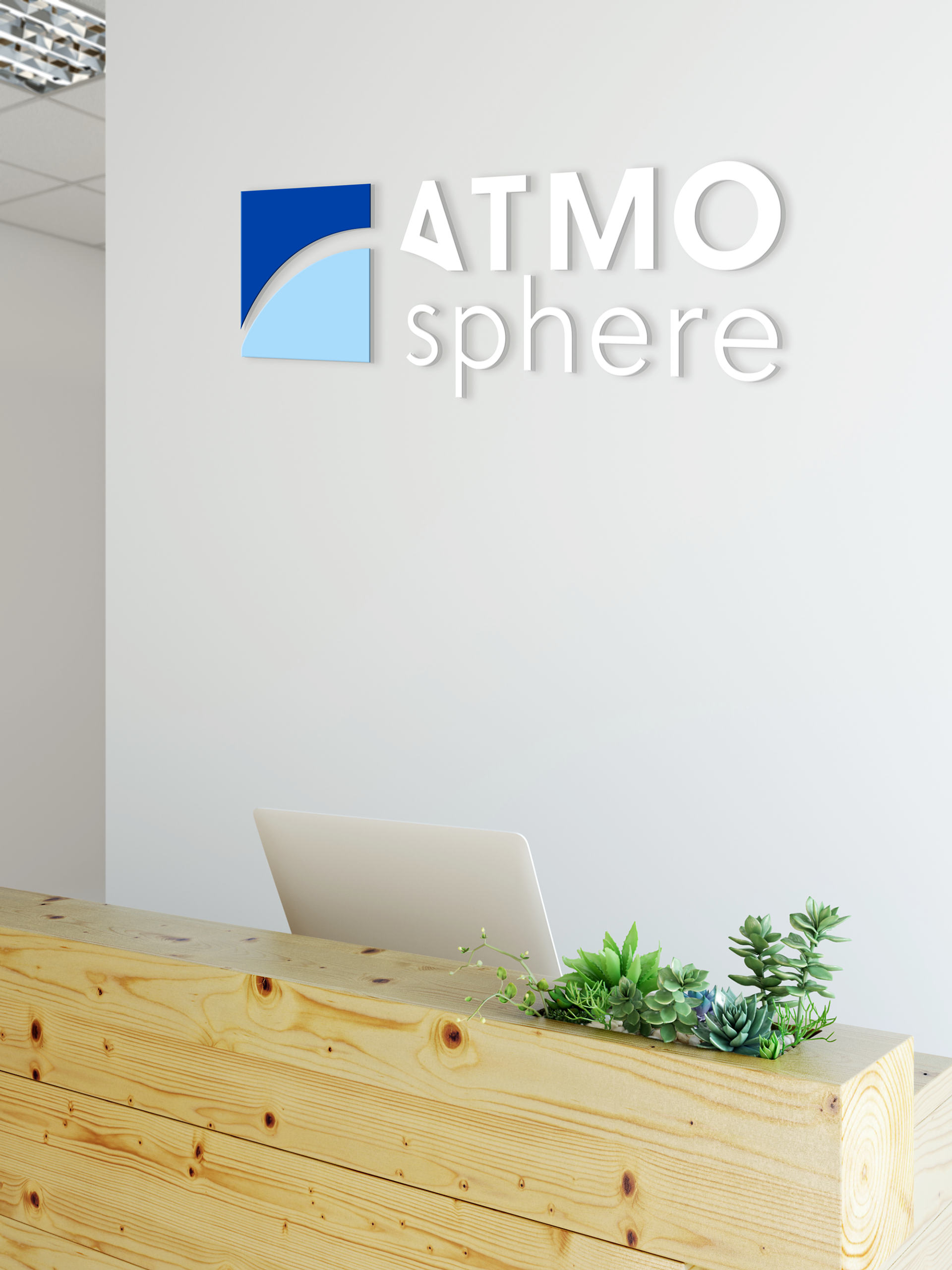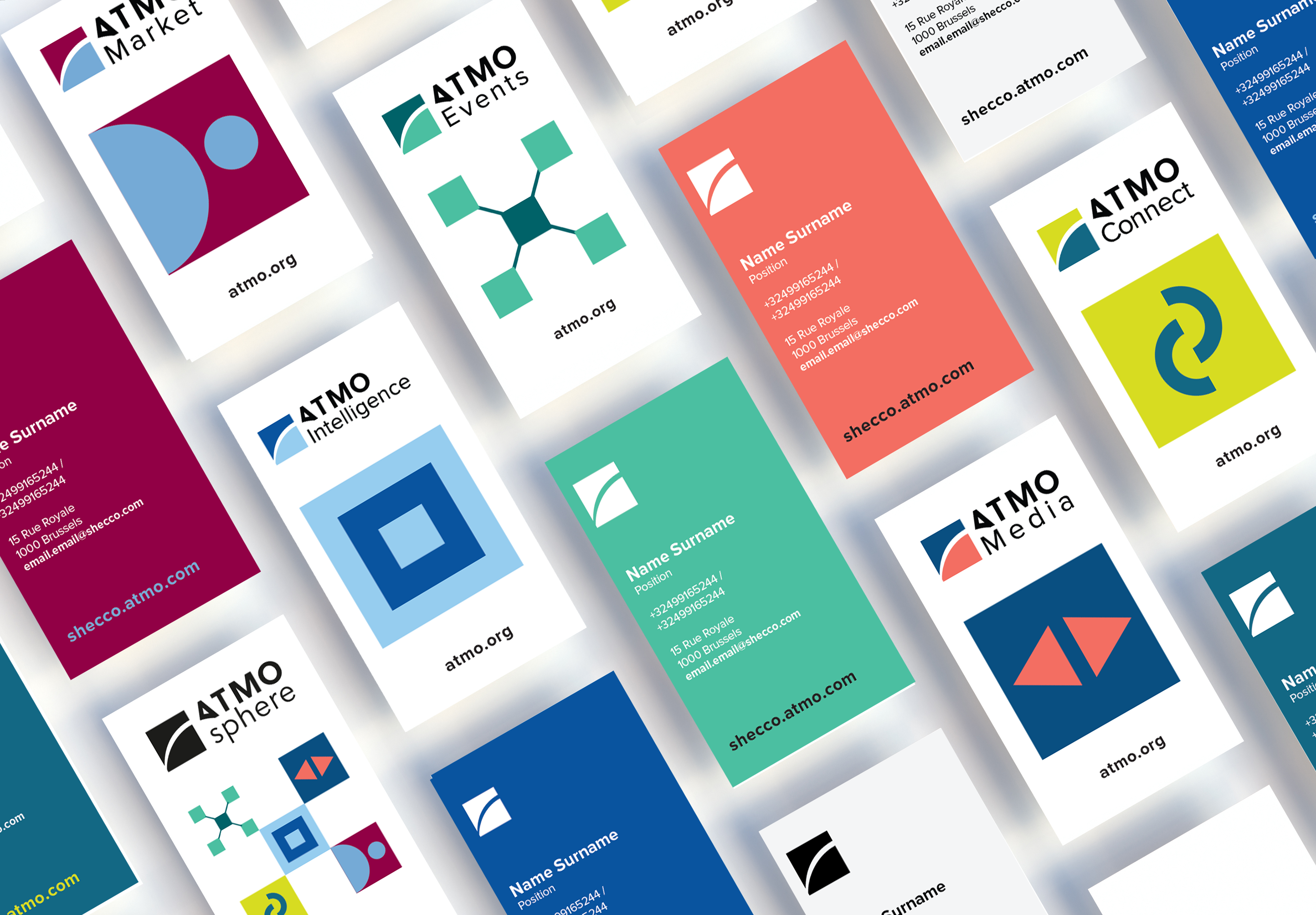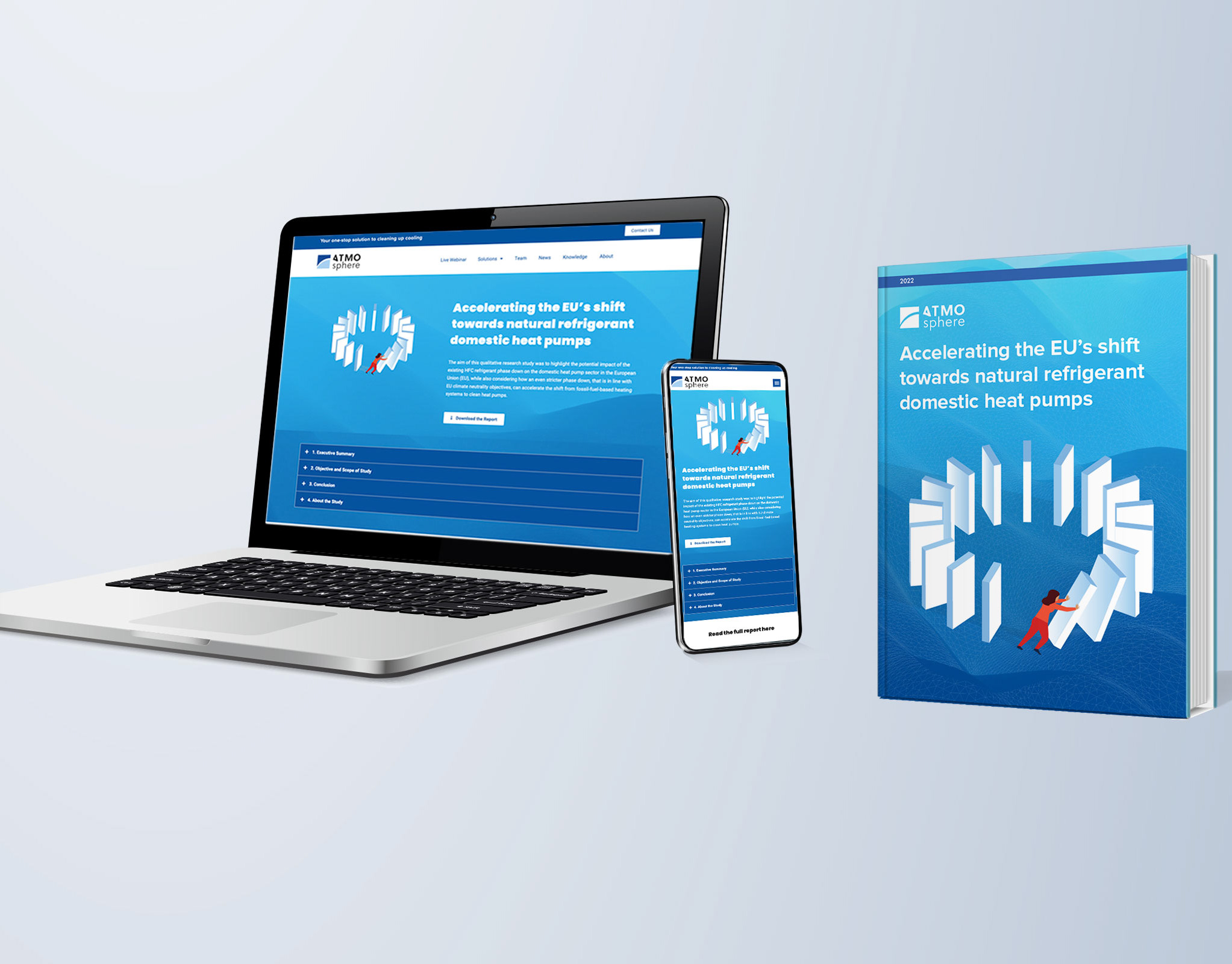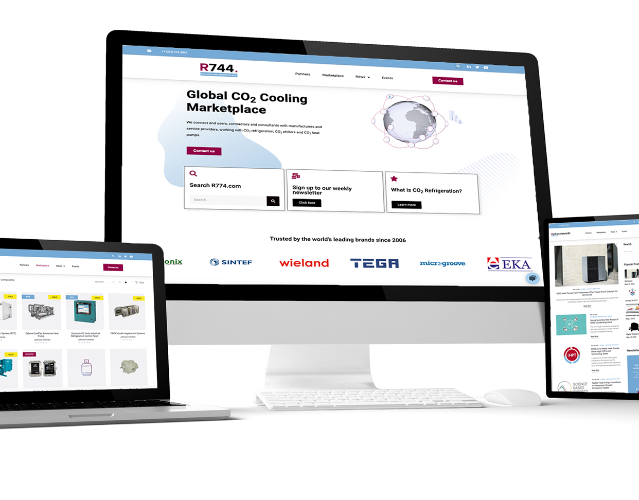
The environmental services company shecco wanted to improve their brand communication and decided to unify all their brands and services under one master brand, the ATMOsphere brand. The ATMOsphere brand identity existed already and has been used for the events department only. After the brand update, it is applied to all departments.

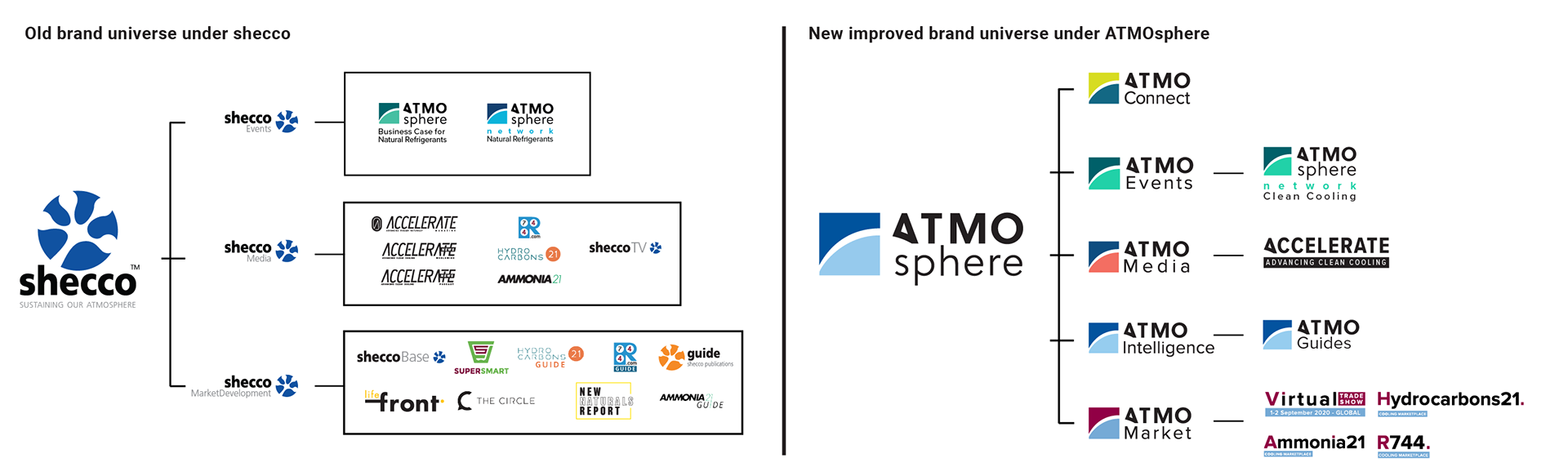
The multiple brand identities have led to challenges in the brand communication and marketing over the past. The decision to streamline the brands and services involved restructuring the departments and reducing the product portfolio. All brand identities were unified within the guidelines of the master brand universe of ATMOsphere.
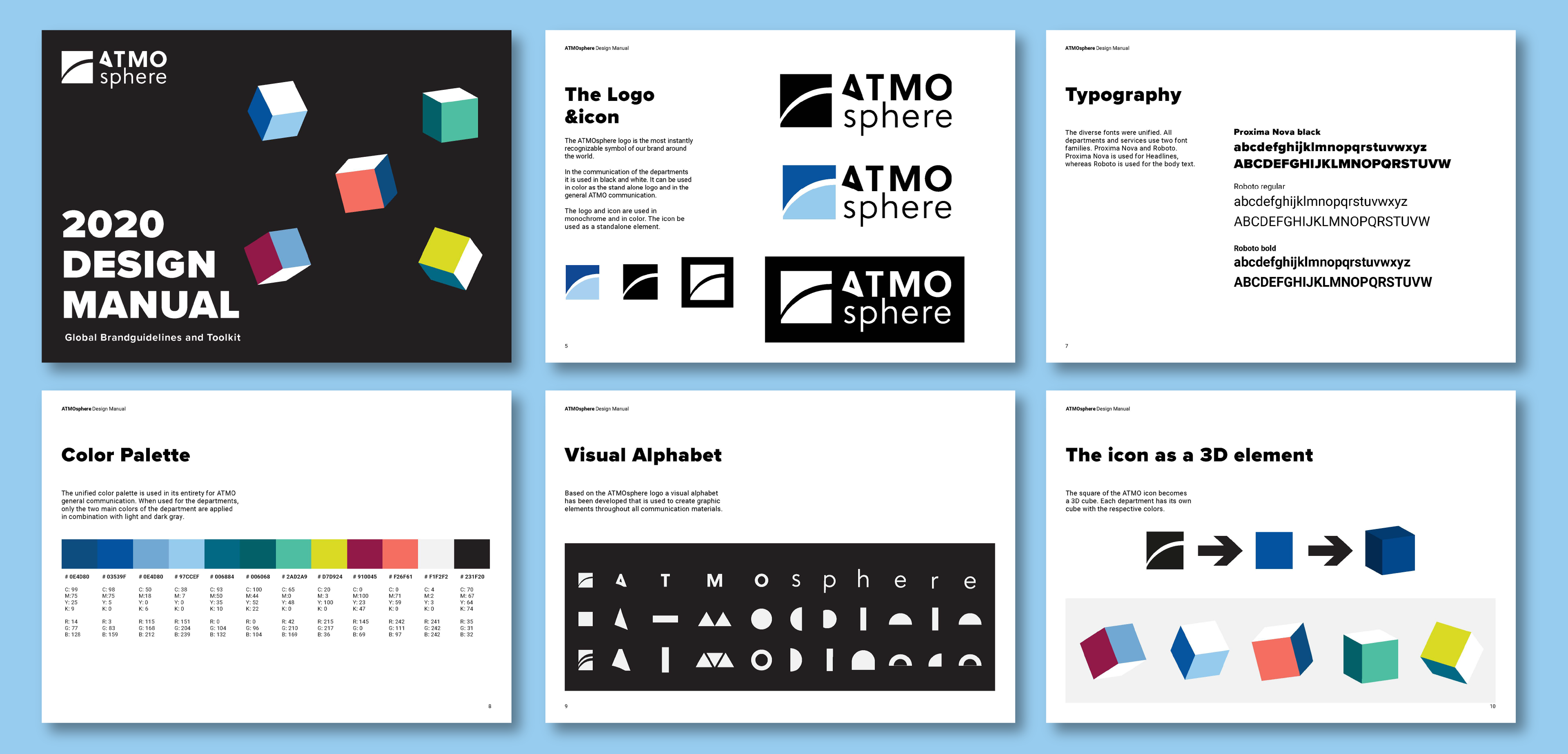
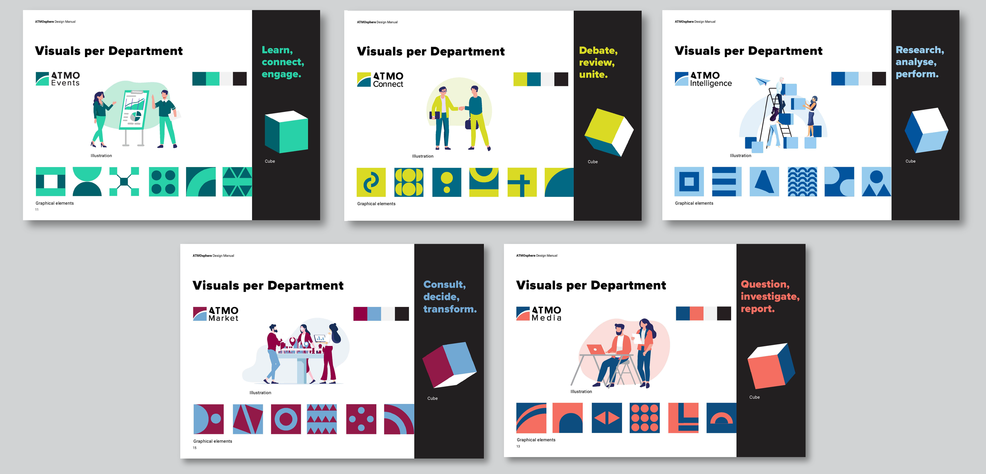
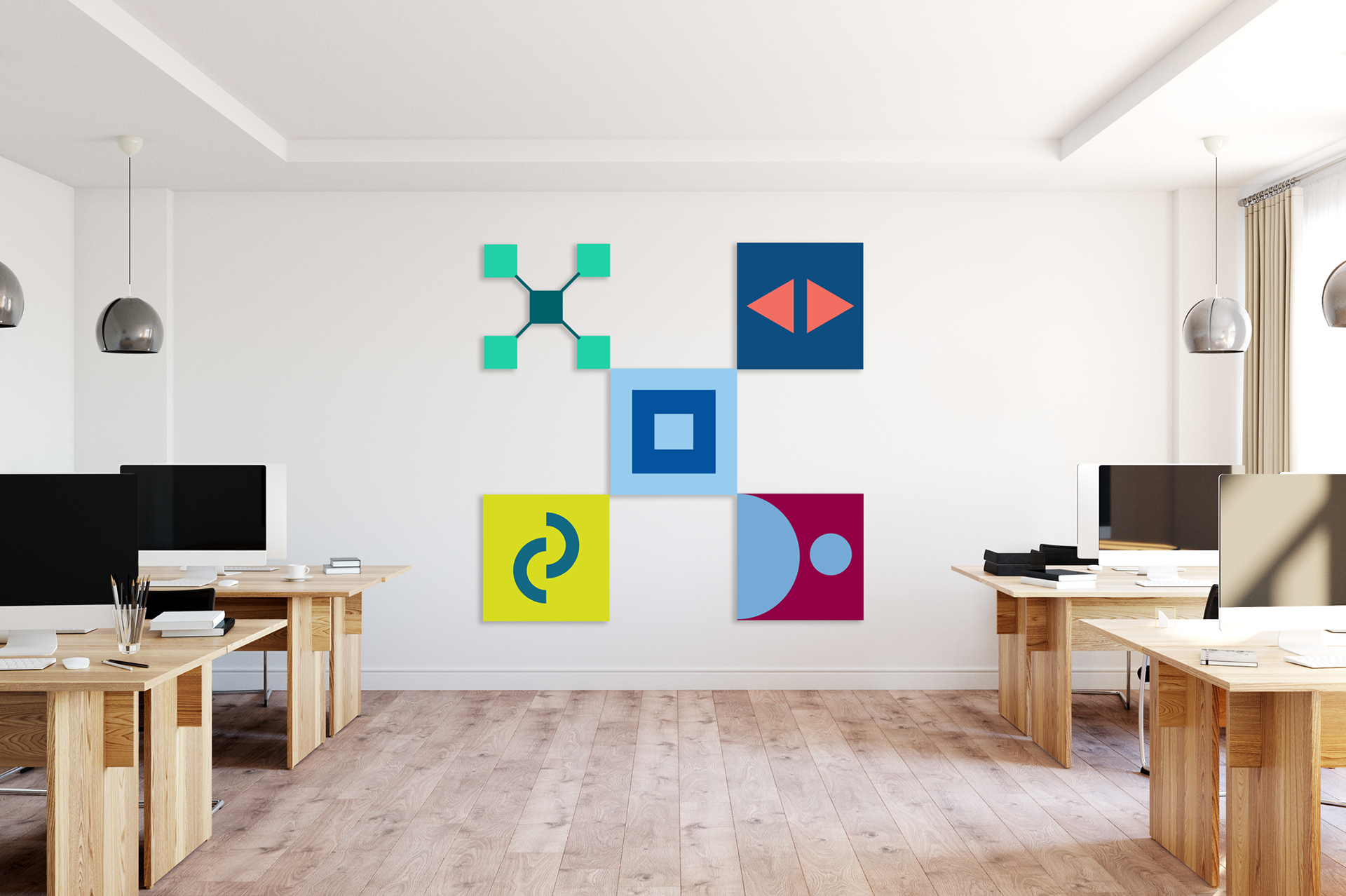
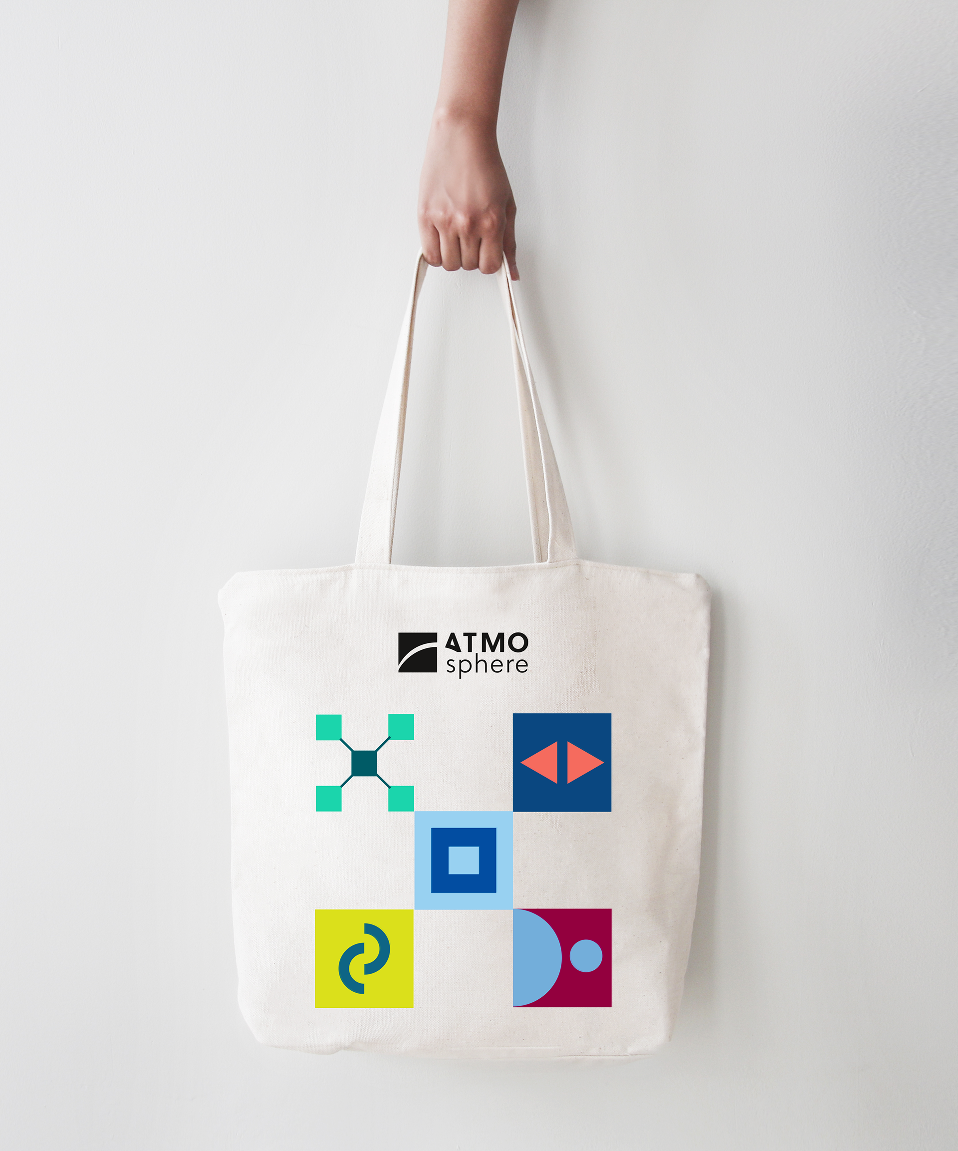
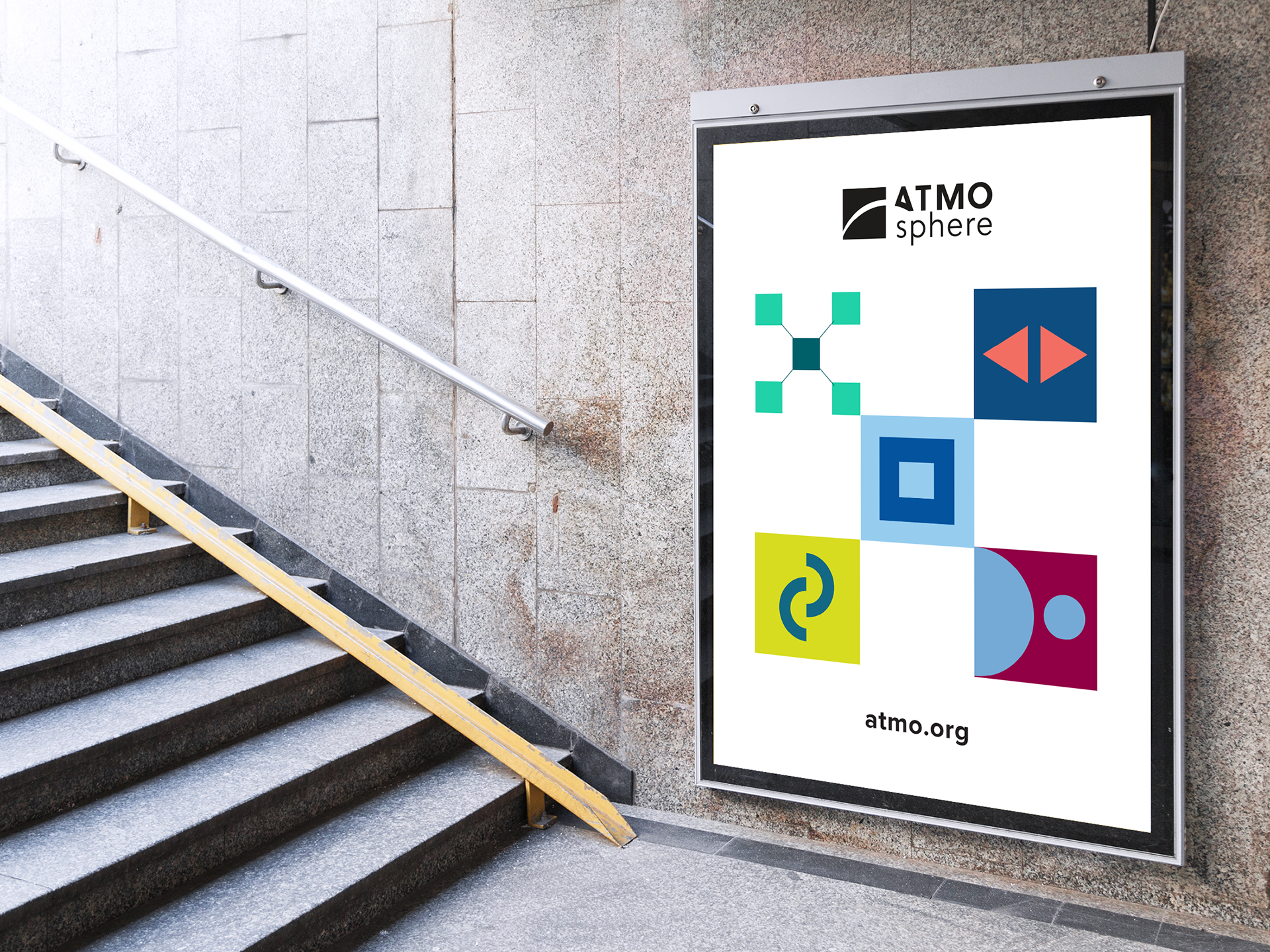
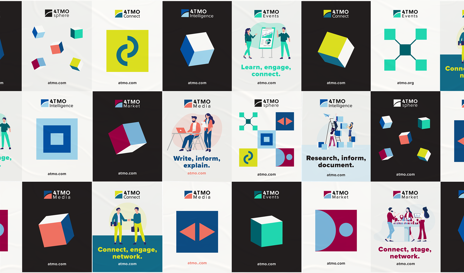
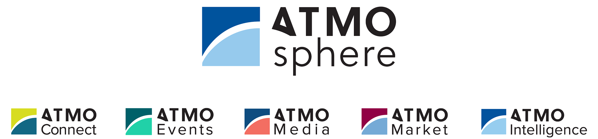
The ATMOsphere brand identity underwent a brand refresh in order to successfully respond to the needs of a larger brand universe. Font families and color palette were unified. The square that the icon is based on, plays a central role in the visual identity. Each department is represented through a different angle of the cube.

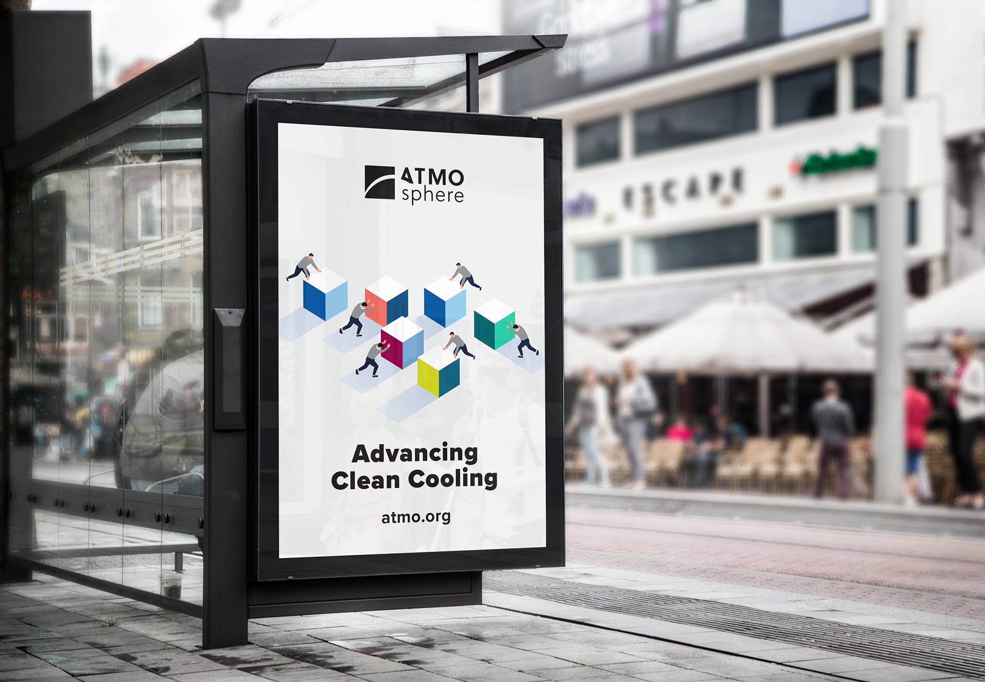

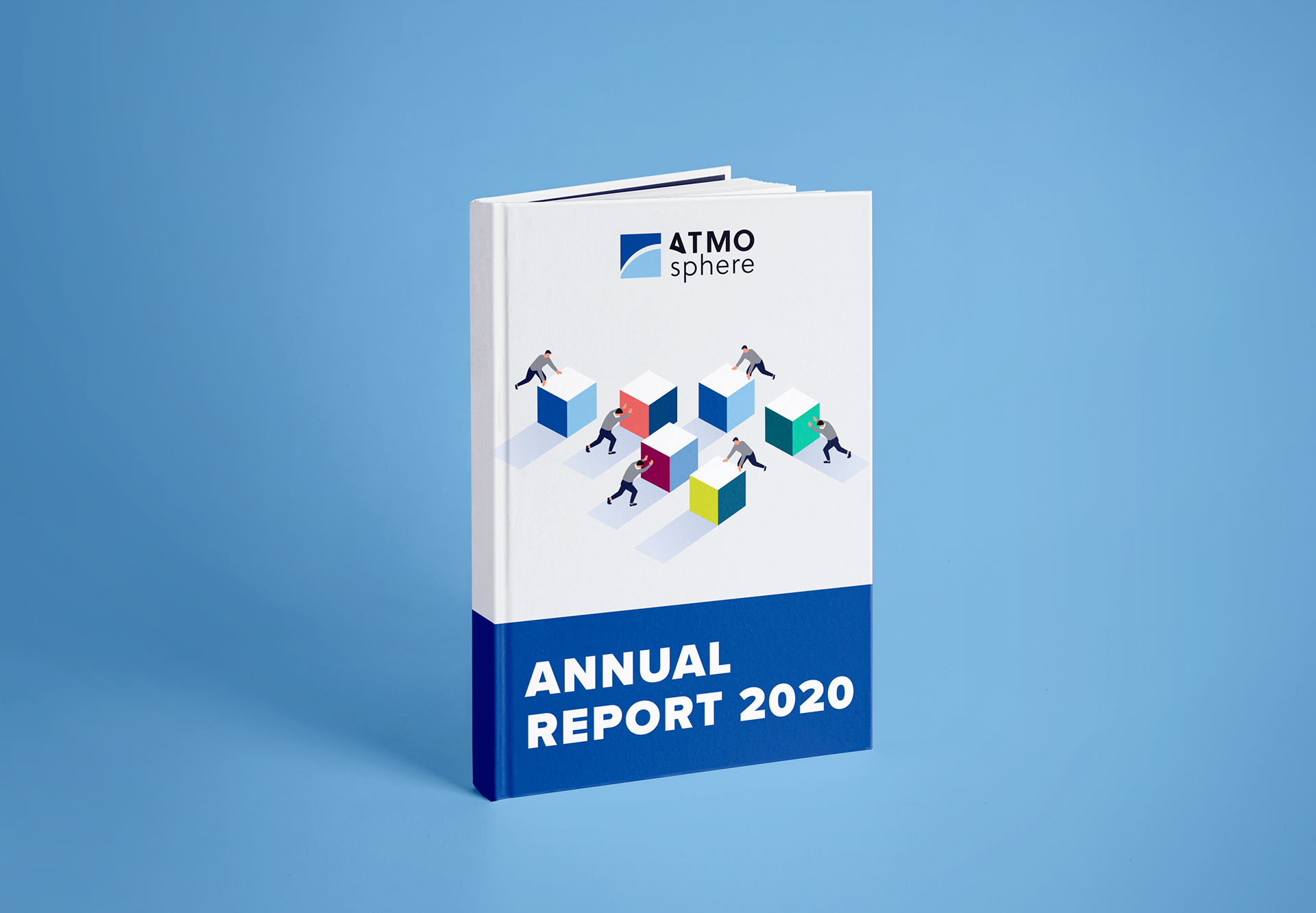
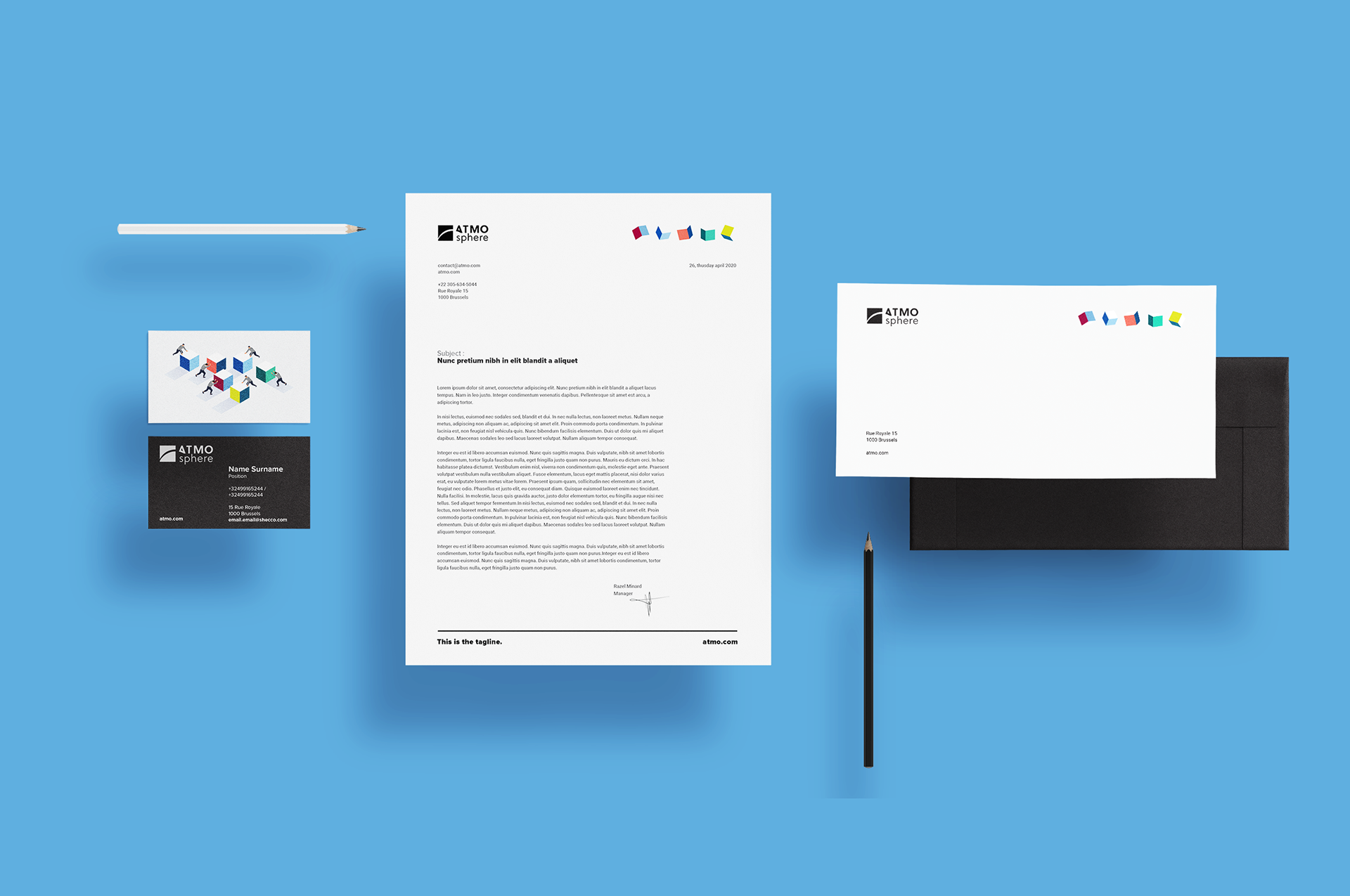
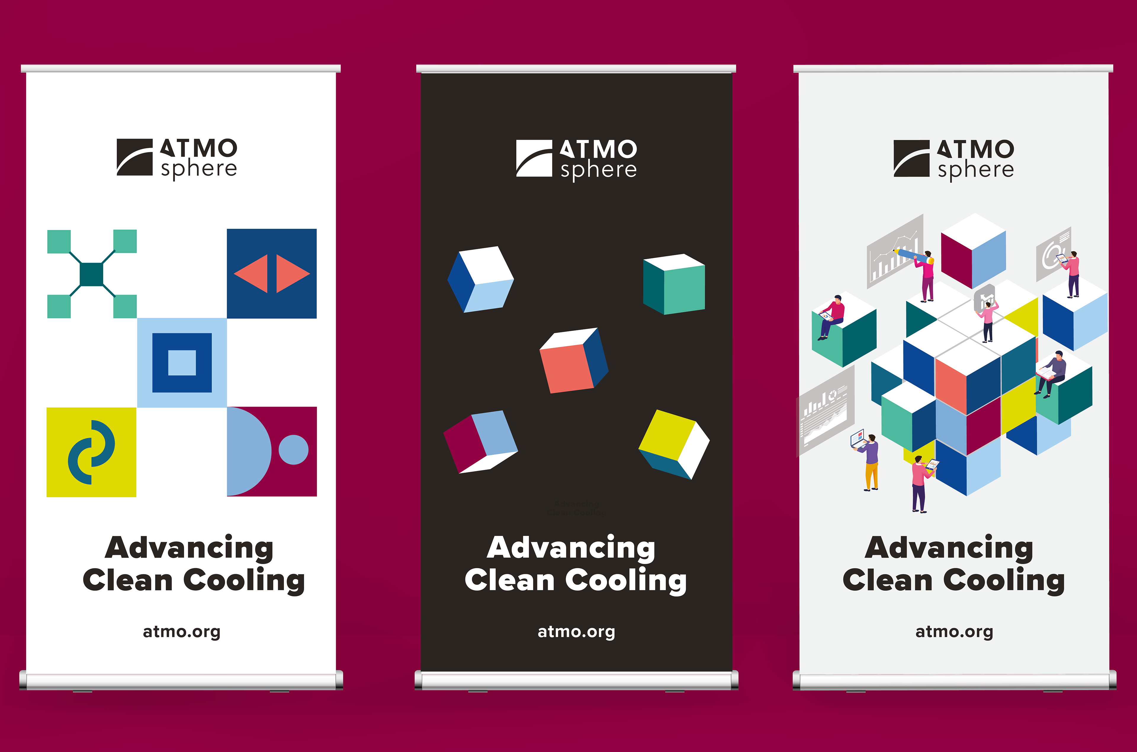
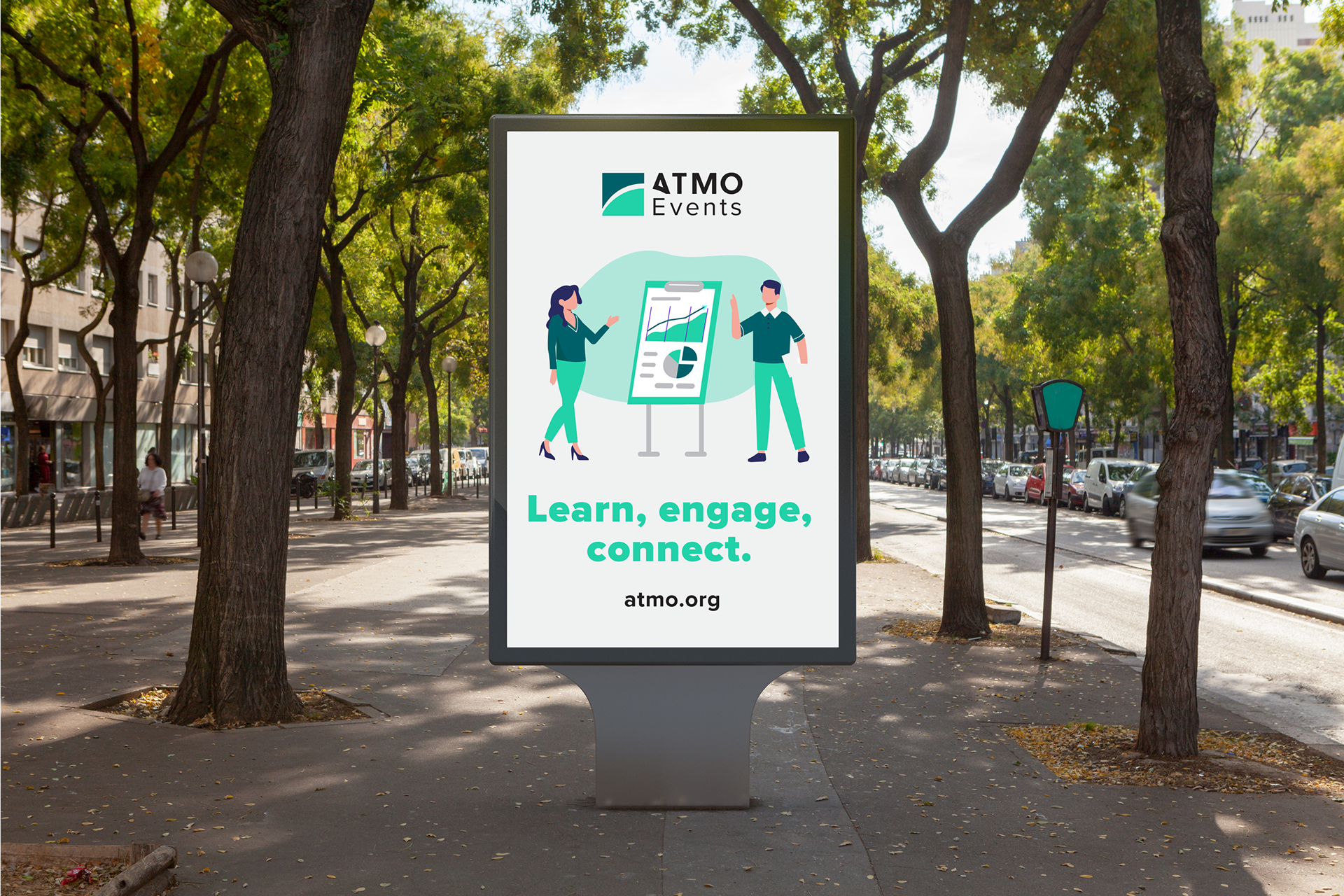
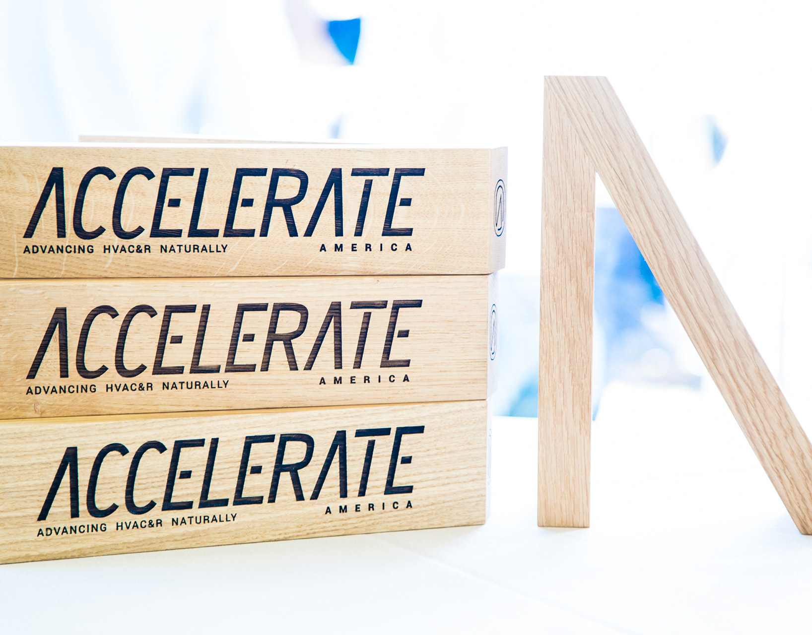
Each department has its own color palette, illustration, cube and graphical elements. They can be used per department and are mixed up in the general ATMOsphere brand communication.